
First I opened up a new document in Photoshop in size A4 to meet the requirements of my Brief. This document is for me to complete my Contents page.

I then added text to my contents in the form of a large headline. I did this text in the same font as my Masthead to create continuity and a house style that I can incorporate across my magazine.

I then selected Edit>Transform>Scale to make the text longer rather than wider so that it took up an appropriate amount of room just like the Masthead on my Front Cover.

I then decided to edit my text so that it matched the style of my Masthead.

I did this by omitting the "Inside" and then selecting Edit>Transform>Scale to make it smaller and then Edit>Transform>Rotate to enable me to put the text within the T of "This."

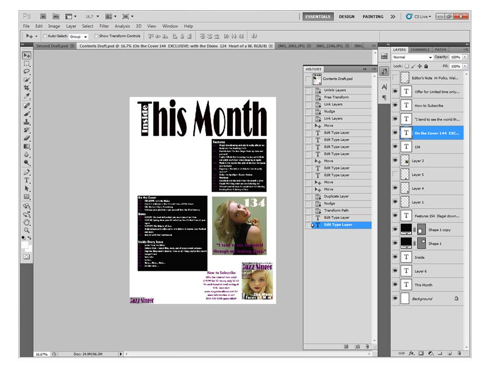
I then added my Features, News, Inside Every Month and On The Cover sections, because I believe they are conventional features of a monthly magazine. A monthly magazine generally has a lot more content than a weekly and my contents page reflects this. I used TW Cen MT Condensed font for this text, this was also used in my left third - this helps to create a house style.

I then added a short note from the Editor I used TW Cen MT Condensed for the font and changed the colour to purple so that it is the same colour as my Masthead text. The Editor's letter is also a conventional feature of a magazine.

I then added a background behind the Editor's letter to create continuity from my Masthead on my Front Cover to my Contents page. I also added a smaller version of the Masthead to create some more continuity. I also added an original image of my main feature star.

I then added a subscription feature, because this is a conventional feature of a magazine. It also help to promote the magazine to the readers, that they save money if they sign up for a subscription. The subscription feature is made-up of a smaller version of the Front Cover and some text with a title as well. The colour and the font is the same as what is used in the Editor's letter - purple and TW Cen MT Condensed.

This is a draft of my contents page, to finish it off I added a picture alongside the Editor's letter.

After constructing my draft contents page I have decided to amend some of the features such as the Editor's letter, because I think that it is a more common feature of a weekly rather than a monthly on a contents page. Whereas the monthly magazines generally have it on a separate page. I have also added a quote to go alongside my main feature photo acting as anchorage and a page number (in Broadway font to match my Masthead) I used TW Cen MT Condensed for the quote.

I also decided to add a background shape to my features section and adjusted the text accordingly so that it would fit within the shape.

I linked the two layers of the text and the background shape so I could navigate them around the contents page together.

I experimented by moving the main feature photo around between the other features on the contents page.
I then decided to add a background shape to my On the Cover, News and Inside Every Issue sections, to create continuity within the contents page.

I then added another original image to my contents page, before this I opened the image in Photoshop and edited the model using the spot healing brush tool, to make the image look more professional. I also decided to move my main feature image back to its original place as their is more room in the top left corner so that I can make the image bigger telling the reader even by just looking at the Contents page that this is my main feature, because the image used to represent it is bigger than the other one.

I selected Edit>Transform>Scale to make the other image bigger to fill the space that was left between the features section and the subscription feature. I also changed the font of the quote for the main feature to Pristina, because I think the serif font represents the main feature star, because she is elegant and glamorous, I also selected Edit>Transform>Skew to make the text look like italics.

I then added a smaller feature headline to my smaller feature's image, so that the readers know what it is about and it also acts as anchorage, I did it in the font Pristina to match the quote from my main feature.

To finish off I added a dateline next to my smaller version of the Masthead in the corner of my page in the font TW Cen MT Condensed, just like on the front cover to create some continuity. I also changed the colour of the large headline to purple to match with the Masthead on the front cover. I aligned the text of my subscription feature to the centre, because it makes the feature look neater.
No comments:
Post a Comment