Thursday, 15 March 2012

Constructing the Contents Page in Photoshop

First I opened up a new document in Photoshop in size A4 to meet the requirements of my Brief. This document is for me to complete my Contents page.
I then added text to my contents in the form of a large headline. I did this text in the same font as my Masthead to create continuity and a house style that I can incorporate across my magazine.
I then selected Edit>Transform>Scale to make the text longer rather than wider so that it took up an appropriate amount of room just like the Masthead on my Front Cover.
I then decided to edit my text so that it matched the style of my Masthead.
I did this by omitting the "Inside" and then selecting Edit>Transform>Scale to make it smaller and then Edit>Transform>Rotate to enable me to put the text within the T of "This."
I then added my Features, News, Inside Every Month and On The Cover sections, because I believe they are conventional features of a monthly magazine. A monthly magazine generally has a lot more content than a weekly and my contents page reflects this. I used TW Cen MT Condensed font for this text, this was also used in my left third - this helps to create a house style.
I then added a short note from the Editor I used TW Cen MT Condensed for the font and changed the colour to purple so that it is the same colour as my Masthead text. The Editor's letter is also a conventional feature of a magazine.
I then added a background behind the Editor's letter to create continuity from my Masthead on my Front Cover to my Contents page. I also added a smaller version of the Masthead to create some more continuity. I also added an original image of my main feature star.
I then added a subscription feature, because this is a conventional feature of a magazine. It also help to promote the magazine to the readers, that they save money if they sign up for a subscription. The subscription feature is made-up of a smaller version of the Front Cover and some text with a title as well. The colour and the font is the same as what is used in the Editor's letter - purple and TW Cen MT Condensed.
This is a draft of my contents page, to finish it off I added a picture alongside the Editor's letter.
After constructing my draft contents page I have decided to amend some of the features such as the Editor's letter, because I think that it is a more common feature of a weekly rather than a monthly on a contents page. Whereas the monthly magazines generally have it on a separate page. I have also added a quote to go alongside my main feature photo acting as anchorage and a page number (in Broadway font to match my Masthead) I used TW Cen MT Condensed for the quote.
I also decided to add a background shape to my features section and adjusted the text accordingly so that it would fit within the shape.
I linked the two layers of the text and the background shape so I could navigate them around the contents page together.
I experimented by moving the main feature photo around between the other features on the contents page.
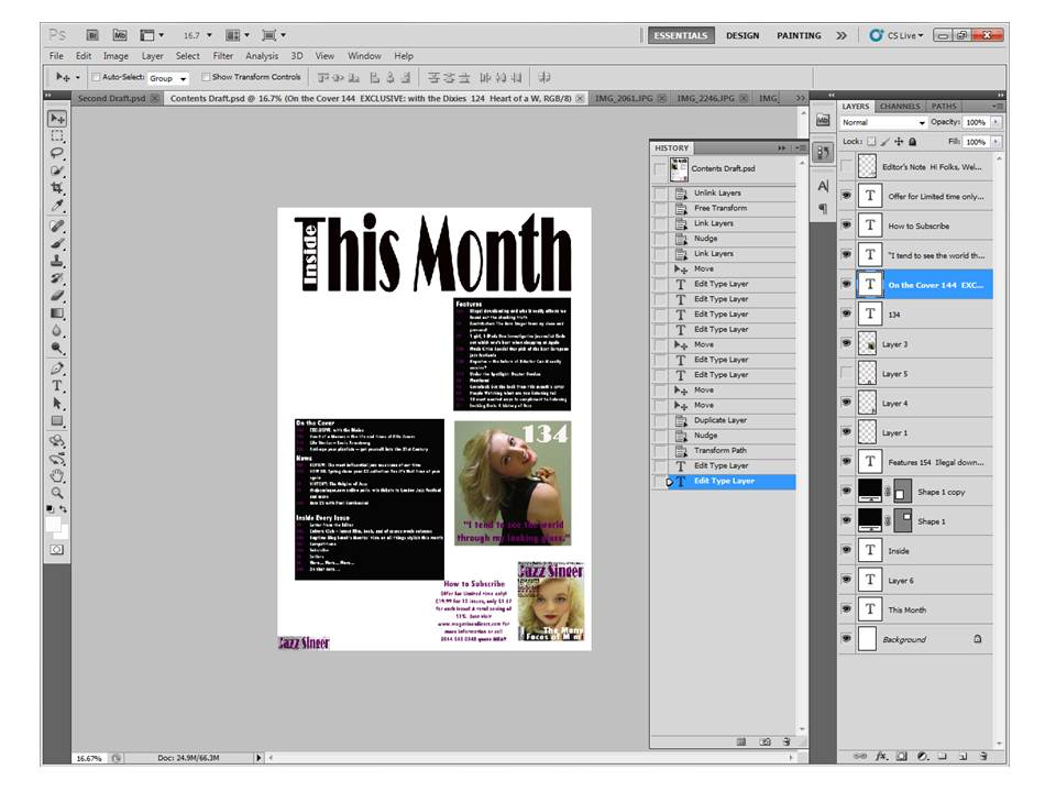
I then decided to add a background shape to my On the Cover, News and Inside Every Issue sections, to create continuity within the contents page.
I then added another original image to my contents page, before this I opened the image in Photoshop and edited the model using the spot healing brush tool, to make the image look more professional. I also decided to move my main feature image back to its original place as their is more room in the top left corner so that I can make the image bigger telling the reader even by just looking at the Contents page that this is my main feature, because the image used to represent it is bigger than the other one.
I selected Edit>Transform>Scale to make the other image bigger to fill the space that was left between the features section and the subscription feature. I also changed the font of the quote for the main feature to Pristina, because I think the serif font represents the main feature star, because she is elegant and glamorous, I also selected Edit>Transform>Skew to make the text look like italics.
I then added a smaller feature headline to my smaller feature's image, so that the readers know what it is about and it also acts as anchorage, I did it in the font Pristina to match the quote from my main feature.
To finish off I added a dateline next to my smaller version of the Masthead in the corner of my page in the font TW Cen MT Condensed, just like on the front cover to create some continuity. I also changed the colour of the large headline to purple to match with the Masthead on the front cover. I aligned the text of my subscription feature to the centre, because it makes the feature look neater.

Wednesday, 14 March 2012

Constructing the Front Cover in Photoshop

To construct my Front Cover I used Adobe Photoshop CS5, this technology allows me to edit photos and then insert text and other features on top e.g. Masthead and a bar code. The layers allow me to move features around so that they are either underneath or on top of other features.
I opened a new Photoshop document in size A4 to meet the requirements of my brief.
I then inserted some text for my Masthead because it is a conventional feature of Print Magazines. I made the text a big enough size so that it filled the width of the A4 page.
I then chose to make my typeface longer rather than wider so that it took up a sufficient amount of room as a typical Masthead would i.e. approx a fifth of the page.
I then added the other part of my magazine title within my other text, because I saw it done on the cover of Entertainment Weekly (see below) and took inspiration from that, as I don't think it is commonly done but I thought it looked better than "The Jazz Singer" all on one line.

Then I opened up my chosen image that I wanted to put on the front cover so that I could edit it appropriately.
I have opened my own original image in Photoshop and started by duplicating the image so that it had a background layer and then started editing the photo by using the spot healing brush tool to clear any blemishes on my model's face.
I then chose to use the blur tool selecting Filter>Blur>Gaussian Blur to enable me to edit my photo and enhance my model's skin.
I adjusted the Gaussian Blur to a suitable level so that I could still see the outline of her silhouette, but the skin appeared softer and completely unblemished due to the blurring of the skin tone, it appears less grainy and more porcelain.
I then added a layer to the duplicate to allow me to edit the eyes, mouth and other features.
Then I used the Brush tool to erase away the blurriness around the model's eye, mouth and other key features i.e. nails, nose, eyebrows and pearls on her dress.
This is the finished image after the editing that I did.
I then opened up my image of glitter to use as a background for my Masthead, an idea which I got from looking at a past issue of InStyle magazine. (see below)
Then I added the glitter background to my masthead and changed the colour of my font to white, which is still a conventional colour to be used within magazines. 
I created a bar code using http://www.barcodesinc.com/generator/index.php this website allowed me to type in some text and generate a bar code from it and inserts it onto the bar code. I put the issue no. 054 and the price £3.40, allowing me to incorporate three typical magazine features together into one.
I then selected all, copied and pasted it onto my background. I then selected Edit>Transform>Shift and held down the shift key while adjusting the size of my bar code so that the length and width stayed within the same proportion. I made it a suitable size to fit into a bottom corner of my magazine.

Then I selected Edit>Transform>Rotate to turn it 90 degrees so it was portrait rather than landscape.
After saving my Masthead as a JPEG file using the Snipping Tool (as seen above) I opened it up in Photoshop to allow me to select only the Masthead.
I then used the Masthead to insert it onto my original background and then selected Edit>Transform>Scale to make it smaller and then rotate it to have a smaller copy of it on my bar code. I did this because I had seen it other magazine for example on the cover of InStyle. (as previously mentioned above)  
I moved my Masthead text down slightly to incorporate room for a Skyline, enabling me to add another smaller feature to my magazine in another way other than a left third.
Then I added my edited main feature photo to then be able to add text around my model's face.
I then added my own original image of glitter to put behind my masthead text, then I changed the colour of my Masthead to purple to allow me to create a house style throughout the remainder of my contents page and double page spread. I also change the small Masthead on the bar code and the colour of the Skyline feature.
I then started to add all of my text like the left third and the main feature headline, because these are the conventional features of a magazine.
I moved my bar code to the other side of my magazine so that I could move the main feature headline further towards the right and make it bigger to make it completely obvious to the reader that it is the main feature of the magazine. I also edited the size of the text in the left third so that it was suitable considering they are the smaller features of the magazine. I also changed the colour of part of my main feature headline and a line in my left third to fit in with the house-style.
I then changed the font of main feature headline and added a quote to act as anchorage to draw in readers. I selected Edit>Transform>Skew to edit the quote text and make it look italic, which I think is a suitable way to represent that text because it has been taken from the body text of my double page spread.
I then selected all of the text items in my left third and selected Edit>Transform>Scale to adjust the size of them equally. I made it longer and narrower so that the text didn't cut across the main feature photo.
I aligned the main feature headline centrally to draw the reader's eyes into the middle where the text and photo of the main feature are.
Then to finish off my Front Cover I moved the left third text more towards the right so that there is a suitable amount of room around the edges of my magazine. I also moved the bar code back to the right of the cover so that there isn't too much on the left side. I finished off by adding a dateline above the left third, a conventional feature of magazines, I used an even smaller font because it isn't a very important detail of the magazine, but I felt it still needs to be featured.