Tuesday, 10 January 2012

New Ideas after completing a Draft Front Cover

After producing a draft front cover for my music magazine I now know that I need to re-take some images and comment on what I was trying to achieve from each of them, because my previous images look under exposed and generally out-of-focus. I have thought about some images of other magazines that have influenced when I have re-thought what I'd like to see within my Front Cover.

I now have more ideas about what sort of ideology I wanted to portray through my magazine. Through my draft front cover I was trying to convey the idea of a rebellious Alice, but I don't think that this is as suitable for my intended audience. So I am going in a slightly different direction within the same genre and the idea of being transported into another world in the main feature. After researching the most popular music magazines in Britain circa. 2011

  • Top of the Pops 98,030
  • Mojo 87,262
  • Q 80,418
  • Kerrang 43,033
  • NME 29,020 [1]

I don't believe there is a magazine appealing to a dominated audience of women, but the music industry has several high-flying, successful female artists such as Adele, Ellie Goulding, Jessie J and Duffy.

I like this front cover of Billboard magazine, because it represents Adele as a new and upcoming artist with something to hide. I think it has a hidden message and appeals to the readers by msking them think that there is more to this cover than meets the eye. It allows the audience to think that they don't know all there is to know about Adele "Who's That Girl?" implies that we don't know about, but suggests that we should.
I like this front cover of ELLE magazine, because it has a conventional left third and masthead, but they are set out in a alternative way. The size of the typeface is the only indication as to which artists are their heavily featured ones and which ones aren't featured as much.
I think that this issue of Entertainment Weekly is a good idea for inspiration as they have two words for their title of the publication in the masthead in one word. The word weekly is embedded within entertainment, which I like because it is different from what I have seen before.
I like this front cover of Q because their subtitle "blows us away" to the main feature headline links to the main image of Adele with windswept hair. I like the subtle yet effective and eye-catching make-up that highlight the best features of her face. I also like their use of a splash to mark their 300th Issue.
I like this front cover of Rolling Stone due to its use of different fonts in it's right third to distinguish between the importance of their features and also the more prominent features have subtitles in a smaller typeface.
I like this front cover of Vogue magazine with orange Masthead and main feature headline it is less conventional, but works really well with "Autumn's Essentials." As the colour orange holds connotations of autumn and autumn leaves.
I really like this front cover of InStyle due to the gold glittery masthead and how it links to the model's dress and the smaller version of the masthead in the bar code also makes it look really professional.

I like this cover of Billboard magazine due to the concept behind it "Woman of the Year" suggests a award is involved and the red curtain holds connotations of awards and Hollywood.
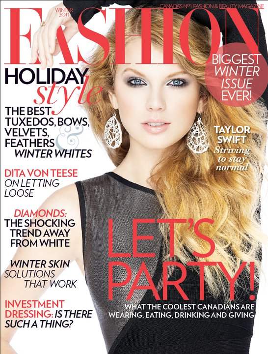
I like this magazine front cover due to their eye-catching image and use of lots of text and smaller features without distracting your point of focus away from the main feature image. I also like the variations of font to represent different features.
I like this magazine front cover with its bold, eye-catching image and well structured text and smaller features.
I like this example of Entertainment weekly's front cover due to its masthead having a word within another word and the bold use of colour with a blue background.
I like this front cover due to the image's alignment to the right giving space for the left third and the use of black and red alternately used for the text.

Friday, 16 December 2011

Music Magazine Front Cover Draft

This one has conventional magazine features such as a bar code, issue no, dateline, masthead, Smaller feature, subtitle, Main Feature: Headline and Image.
In this draft cover I have experimented with a different main image and background. The colour of the font doesn't work as well against this background, but the red typeface still stands out.
In this draft cover I have experimented with the name of the magazine and the Masthead as a whole. I changed the font and the size of the text to see what works better.
I have experimented with a different main image in this draft cover. This makes the model look more vulnerable as if we are looking down on her. This is to link with the idea of Alice in Wonderland and her being a vulnerable young lady susceptible to daydreaming.

Monday, 5 December 2011

Photoshop Practice

This is the image I was given to edit, as you can see she has a lot of blemishes and spots on her skin that can be taken away through editing on Photoshop to make the image look more professional for a print publication.

This is an after image to show how I have used photoshop to enhance an image. By making the model's skin blemish-free, adjusting the layers of the photo by putting a dark and light layer underneath and adjusting the opacity it makes her skin look flawless and porcelain-like. The image is now more suitable to use for a print publication.

Saturday, 3 December 2011

Magazine Outline

This is the idea that I have for the outline of my music magazine, I will carry on to add a main feature photo and background. This contains a Masthead, bar code, main feature headline and a smaller feature. A left third could be added as this is a very common convention of a magazine's front cover.

Friday, 2 December 2011

Creating a Draft Front Cover in Photoshop

I started by opening up a new document Photoshop in A4 size to match the Brief of my Portfolio.
I then opened up an image in Photoshop for my background this will take up the whole size of the A4 so when I add it to my background layer I will select Edit>Transform>Scale in order to make it fit the whole of the background.
I have opened up my chosen image in Photoshop to enable me to edit the photo appropriately.
I have cut around the model in my chosen photo as I have already chosen another background for my image.
I have copied the layer of my photo so that I have a back-up copy of the photo or if I erase part of the photo there will still be one there.
This print screen shows the photo of my model against the background I have chosen. One thing that is wrong with this image as a final version is that the image of the model is quite jagged around the edge where I have cut her out from her original background.
In this image I have added a Masthead and my main feature headline, through creating this draft idea I wanted to experiment with using an alternative background to the one that was in the original photograph.
In this draft idea I have used a different image against a different background in the same way I had previously created the other draft idea. I chose the idea of her lying among the flowers, because it represents her daydreaming and that is how Alice ended up in wonderland. It also fits with the idea that wonderland isn't real and is therefore far more beautiful than our reality.
This front cover features a bar code, a conventional feature of a magazine, this is to keep track of how many are sold. I chose the name of the magazine "Sway" because it is a well known song, but after researching the roots of the song I have found that it was originally Spanish and has more of a mambo rhythm and therefore not suitable for my music genre.
The colour of the text doesn't work against this background. The masthead is more visible, but the main headline isn't and that can potentially sell a magazine if it has a good anchorage to go with it.
 This is another idea for the title of my magazine "Jive." This has more connotations associated with the jazz genre of music. I have also changed the font to Cambria and the colour to a brighter red to make it more eye-catching. The quote from the article acts as a subtitle/sell line for the main feature. I chose to put it in italics to separate it from the main text.
This print screen of the layers in Photoshop shows how I have used an outre glow effect on my main feature headline I did it red to keep within the house style that I have created.

Thursday, 1 December 2011

Music Magazine Barcode

I used http://www.barcodesinc.com/ to create this barcode for my magazine it incorporates the issue number and price features, all are conventional features of a magazine. I have to price my magazine at £3.40 after researching the average price of magazines. Also my magazine is a monthly and is aimed at mainly women in ABC1, therefore I think this is a reasonable price for my magazine.