Thursday, 3 November 2011

Editing on Photoshop

This shows how I have experimented with the colours of the text to try and link it in with other elements of the magazine including the images, such as the green file and purple pencil case. I was doing this in order to establish a house-style for my magazine. I was aiming to have a consistent font and colour scheme to make my magazine's front cover look more professional.
This photoshop image shows how I have tried using a different logo to represent the institute it is for - Wyke Sixth Form College. The other I used seemed out of place and the colour of it no longer fitted with the colour scheme I have now chosen for the magazine. When the text was all black it fitted with it nicely, but that is no longer the case.
In this print screen I have experimented with the colour again to keep it consistent with the new logo that I have added. I think this helps to establish the house style and compliments other features of the front cover by them being similar colours.
In this print screen I have moved the masthead to fit in the gap where there is a neutral background so that it is able to stand out more and is more readable among the plain background rather than being barely readable against the window, which is where it was placed. I have kept the date line and issue no. only as wide as the masthead is so that it is kept neat and in line. Otherwise everything would start to look out of place and it wouldn't look as professional.

Draft Ideas

These are my original ideas that I had. I had three key ideas that I was thinking about developing. The first one was a magazine that would be mainly put together by the Student Association and would include all the latest fundraising news and party information. Maybe a feature on how to get the most out of your NUS Card. It would focus greatly on the social aspect of college life.

My second idea was to do a Student Paper to link with the enrichment course available at Wyke College. It would be put together and all ideas inputted by students of Wyke. I was thinking inside that there would be subject areas where each department could have it's own "corner." For example the "Languages Corner" could include the latest photos and information on the exchange trips etc. The Maths department would include news of their most recent Maths challenge. It would all depend on the subject areas that the Students involved are interested in, yet this could be one of its disadvantages that it might not include all the current subjects at one point or another. It could also include such features as "How to..." "Pros and Cons of University life." This magazine will be mainly focused solely on the students of Wyke and what they want to see in their magazine and what information they feel that they need to be aware of.

My third and final idea was having a newsletter-style publication that would be sent home to parents to let them know about Wyke's latest achievements. It would such features as latest exam results, successful trips, extra-curricular activities, a section informing them of their most improved and highly achieving students and where they are going next in terms of University and apprenticeships etc.

Draft Photos 37 - 52


Draft Photos 16 - 36


College magazine Prezi

Wednesday, 2 November 2011

Draft Photos 12, 13, 14 and 15


I took these photos as a "storyline" to represent how my model is getting more and more frustrated with her workload. I thought that if I actaully wrote an article for my main feature I would do it on a double page spread and use the photos as a sequence to portray a typical student and how overwhelming their workload can be. In No. 12 she is happy and enthusiastic to get her work completed. In No. 13 she is fairly happy and getting on with her work. In No. 14 she is getting more fed up and scrumples up her work. By the time you get to No. 15 she has given up. I chose not to use them for my front cover because in some of the shots the model doesn't engage with the reader by looking at the camera.

Draft Photo 11

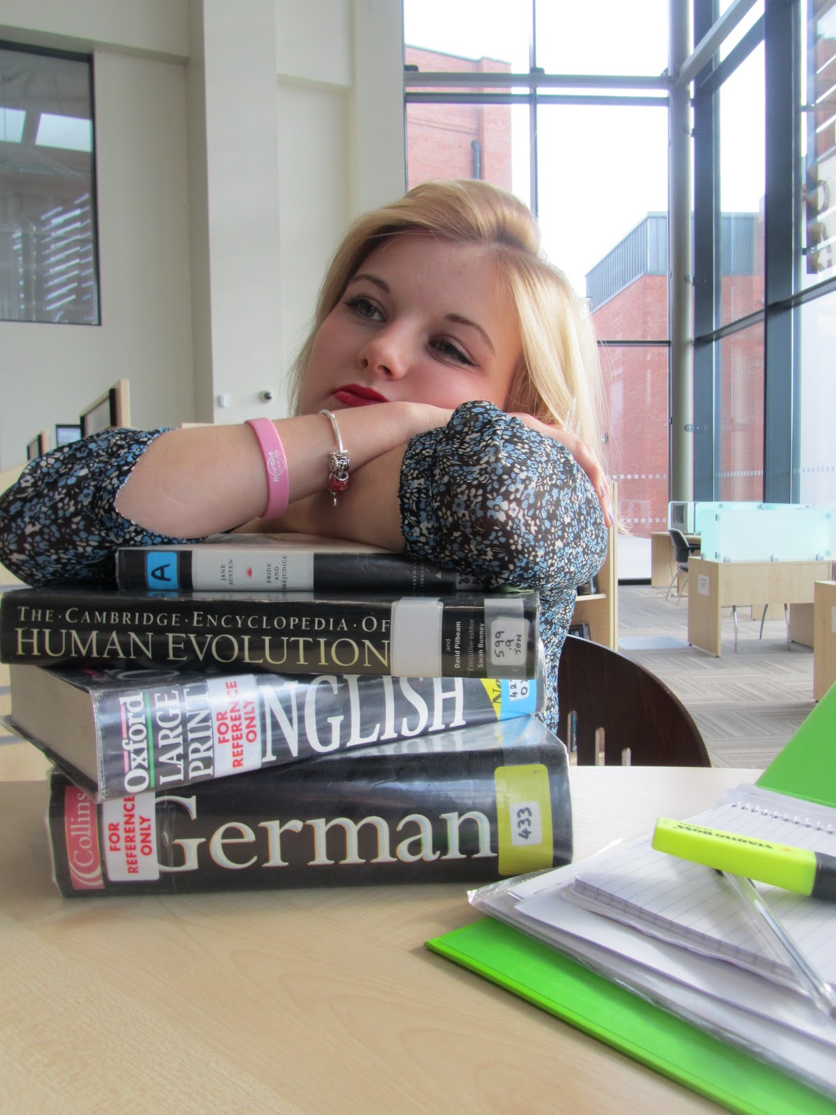
I chose not to use this image for the main image on my front cover, because my model isn't looking at the camera and therefore isn't engaging with the reader. I like that the image represents that the student is tired which shows that she is hard working.