Saturday, 29 October 2011

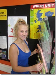
Draft Photo 10

IMG_1797
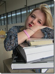
I have chosen to not use this image for my magazine front cover, because the model doesn’t look as though she is enjoying college life and this won’t portray to the reader that Wyke is a great place to be. It doesn’t advertise the right image of Wyke Sixth Form College.

Draft Photo 9

IMG_1817
I have chosen not to use this photo for my front cover because again the left third is blocked and this is an important element of a magazine’s front cover. Although it is a it has the chest upwards of the model, the model is too far away from the camera for this to be a medium close up.

Draft Photo 8

IMG_1782
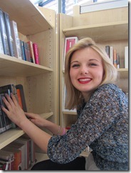
I have chosen not to use this photo for my magazine’s front cover because the left third has been blocked by the bookcase and this is a typical convention of a magazine. This photo could instead be used on the inside of the magazine to highlight the advantage of the library facilities.

Draft Photo 7

IMG_1770
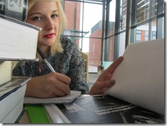
I have chosen not to use this photo for my college magazine’s front cover because there is no room above the model’s head to fit in a masthead. Also the photo is in landscape rather than portrait – which is what I need for the front cover.

Draft Photo 6

IMG_1769
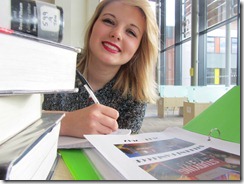
I have chosen not to use this photo for the front cover of my magazine mainly because part of my model’s face is blocked by the corners of the books. Also the model isn’t looking at the camera which means she isn’t engaging with the reader.

Draft Photo 5

IMG_1749
I have chosen not to use this for my front cover because of all the writing and posters in the background. I think it will distract readers from the magazine headlines and could cause problems with text placement.

Thursday, 27 October 2011

Draft Photo 4

I have chosen not to use this photo for my front cover, because the model isn't facing the camera and therefore isn't engaging with the reader. Also the computer blocks the way of the left third meaning the headlines would have to go elsewhere, but this isn't in keeping with the conventions of a magazine.

Magazine Template

I created this template/draft using Adobe Photoshop to give myself an idea of what my final version could look like. At this stage I thinking about possibly changing the font so that it is consistent along with the Wyke logo. Also I am thinking about possibly changing my colour scheme to fit with the Wyke colours. For exmaple instead of using black for all the font I could use green and purple. Although I do see the advantages of using black and white as it will make it seem bolder, thus creating a front cover that will stand out more and grab attention. I would like my front cover to help my magazine establish it's own house-style to enable it to feel more like a professional magazine.

kuler.adobe.com

I used kuler.adobe.com to find a suitable colour scheme that I can use for my magazine. I used Wyke's logo to help me establish the colour scheme. I can now use these colours that kuler.adobe.com has depicted from the logo to help establish a house-style for my magazine. This will give my magazine a professional looking front cover.

Draft Photo 3

 
I have chosen not to use this photo for the front cover of my magazine mainly because the model isn't looking at the camera and therefore isn't engaging with the audience. But I think it is a good image as it shows off the college grounds quite nicely, because of this I think it is a good image to be used inside the magazine.

Draft Photo 2

I have chosen not to use this photo for my front cover, because the photo doesn't really tell the audience anything. The model and her given props don't "grab" the audience and make them feel that they should buy this magazine. This image could instead be used on the inside, for example to represent a student profile.

Friday, 21 October 2011

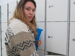
Draft Photo 1

I have chosen not to use this picture for my front cover, because my two models are not making eye contact with the camera and are therefore not engaging with the reader. I could be used somewhere within the magazine, the contents page for instance.

Tuesday, 11 October 2011

Reach - Magazine Conventions and LIIAR Analysis

Magazine Conventions - Reach

L – “West End Girls” focuses on the fact that they are a single-sex school and exaggerates their latest production as being potentially West-End worthy. It tries to show other people their potential for the future.

I – The magazine is called Reach and is a high-school’s in-house magazine at Newland School for Girls.

I – They want to portray their school as the “place-to-be” and looks at the school in a positive way to highlight their achievements.

A – The target audience of this magazine is students, parents/guardians, teachers, governors and prospective students and parents/guardians.

R – It represents Newland School for Girls as being a fun and interesting school that holds lots of opportunities for its students.

Marie Claire–Magazine Conventions and LIIAR Analysis

Magazine Conventions - Marie Claire
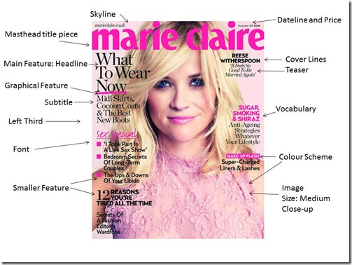
L –  The use of pink in the font, the model's make-up and the model's clothing also the lace suggests they are appealing to women rather than men. Pink as a colour is associated more with women. Lace is seen as delicate and sensitive, which is how many people see women. “What to wear now” is an imperative and is demanding you to wear the clothes that are featured inside. It also suggests that they know what you should be wearing now and inside it will tell you what and where to get it, drawing the reader in. “Sugar, Smoking and Shiraz” is alliteration of the ‘S’ sound and forms together as a phrase. Overall the language used on the cover is informal and some things are said as more commonly as speech for example “Super – Charged Liners and Lashes.”

I – The magazine is Marie Claire and it is published by IPC Media – the UK’s leading consumer magazine publisher.

I – “Think Smart Look Amazing. ” The features of this magazine cover are leading women to be more fashion conscious and self aware. They are mainly appealing to women on a fashion and beauty level.

A – The target audience is women aged 25 – 40.

R – It represents women as being feminine, smart and sophisticated. It also portrays them as being interested in fashion, health, beauty and relationships. It also seems to aiming more at independent women and working Mothers who are interested in climbing the career ladder rather than stay-at-home Mums.